
UI/UX design that customers understand and developers can build
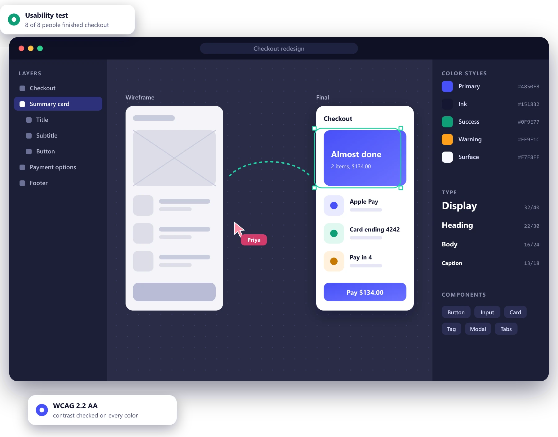
Research, flows, prototypes and design systems for web and mobile products. Our designers work next to our engineers, so what gets designed is what gets built, and every major decision is tested with real users before it costs a sprint.
- Tested with real users before build
- Design systems in Figma and in code
- WCAG 2.2 AA accessibility
Brands we have designed for
- KITH
- O'Neill
- TomboyX
- Bulgari
- CoffeeForLess
- La Ligne
- Sea to Summit
Design work from first research to final pixel
User research
Interviews, analytics reviews and usability tests that show what people actually do, not what they say they do.
UX design
User flows, information architecture and wireframes that solve the structure before anyone argues about colors.
UI design
Visual design that carries your brand into the product, clear on a phone in sunlight and on a large monitor.
Prototyping
Clickable prototypes in Figma that feel close enough to the real thing for users and investors to react to.
Design systems
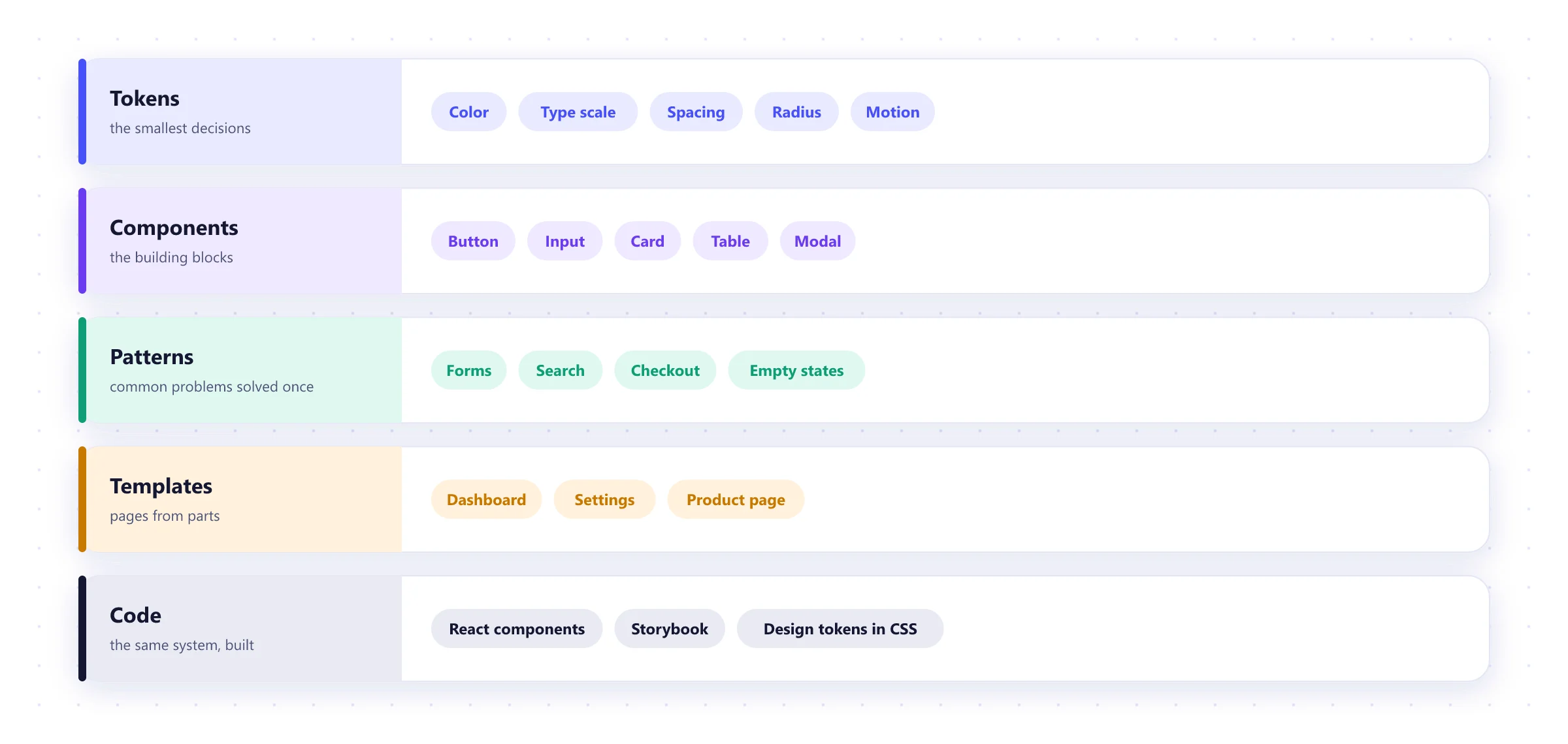
Tokens, components and patterns in Figma and in code, so new pages stay consistent without a designer on every ticket.
See the O'Neill system →Accessibility
WCAG 2.2 AA from the first wireframe, plus audits and fixes for products that were designed without it.
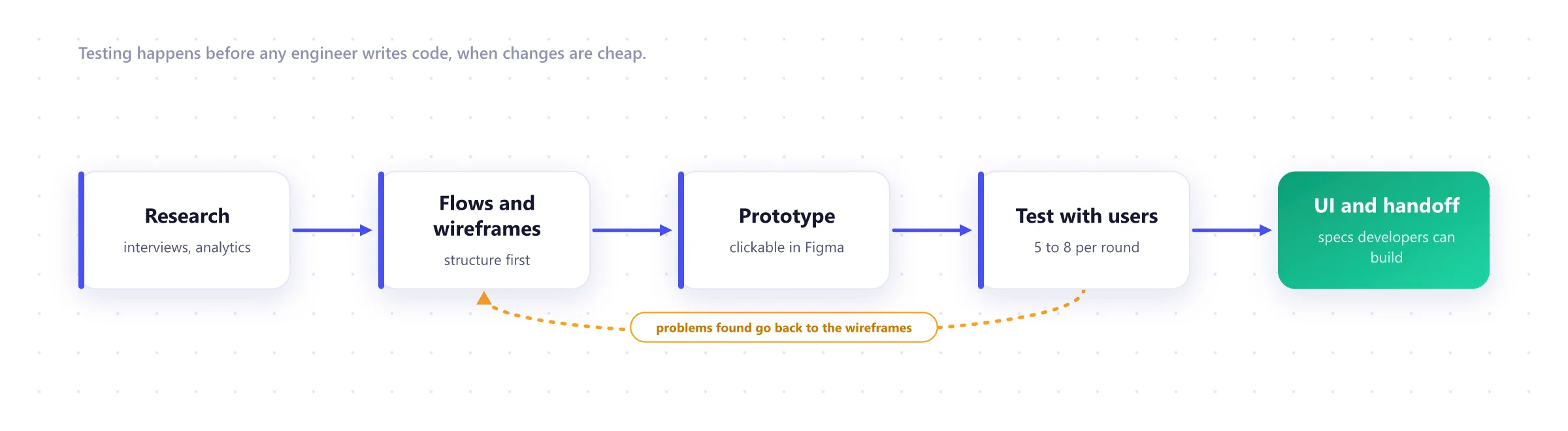
Test early, while changes cost hours instead of weeks
Most expensive product mistakes are visible in a prototype. We make sure somebody from your audience has used the design before engineers start on it.
One system from Figma to production
A design system is a shared set of decisions: colors, type, spacing and components, documented and built once. It speeds up design and development and keeps a growing product consistent. We build the Figma library and the matching coded components together, so they never drift apart.
Design work

A modular design system for O'Neill
A new look and a set of reusable modules for a surf brand with seventy years of history, so the team can build pages without a developer.
Read the case study →
KITH, built for Monday drops
A redesigned Shopify Plus store and an iOS app designed around the weekly release that brings shoppers back.
Read the case study →
CoffeeForLess, easier to shop
A new logo, custom icons and a Shopify Plus store organized around the way coffee buyers actually search.
Read the case study →Deliverables your developers can use
Beautiful mockups that engineers have to reverse-engineer slow everyone down. Every project ends with files and notes a developer can build from directly.
- Research findings in a short readable report
- User flows for every key journey
- A clickable prototype tested with real users
- A Figma library with tokens and components
- Annotated specs for states, errors and edge cases
- An accessibility checklist signed off per screen
What we design with
Design
- Figma
- FigJam
- Tokens Studio
Prototyping
- Figma prototypes
- ProtoPie
- Framer
Research
- Maze
- Lookback
- Hotjar
- Microsoft Clarity
Handoff
- Figma Dev Mode
- Storybook
- Zeroheight
Accessibility
- Stark
- axe DevTools
- VoiceOver
- NVDA
Analytics
- GA4
- Mixpanel
- Amplitude
UI/UX design FAQ
Do you only design, or build as well?
Both. Our designers work alongside our engineers, so we can take a product from research to release. We also design for teams that build in-house, and hand over files and specs their developers can work from without guessing.
How long does design take?
A single product flow, such as onboarding or checkout, usually takes two to four weeks including research and testing. A full product or a design system typically takes six to twelve weeks, often in stages alongside development.
How do you test designs with users?
We put clickable prototypes in front of five to eight people from your target audience per round, watch where they get stuck, fix it and test again. Five users per round catches most of the serious usability problems.
Can you work with our existing brand?
Yes. We turn brand guidelines into product design, with colors, type and components that work on small screens and meet accessibility contrast rules. If the brand itself needs work, we can help with that too.
Can you redesign an existing product without upsetting current users?
Yes. We study how people use it today, keep what they rely on, and roll changes out in stages where possible, measuring the effect of each one.
How do you handle accessibility?
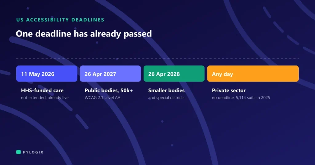
We design to WCAG 2.2 AA from the start: color contrast, focus states, text sizing, touch targets and screen reader labels. Our guide to web accessibility requirements explains what that covers.
Worth reading before you start
 Web accessibility requirements
 MVP scope: what to build first
 How to write a software requirements brief
Have a product that needs a better experience?
Send us the product or the idea and tell us where users struggle. We will suggest how to find out why, and what we would design first.