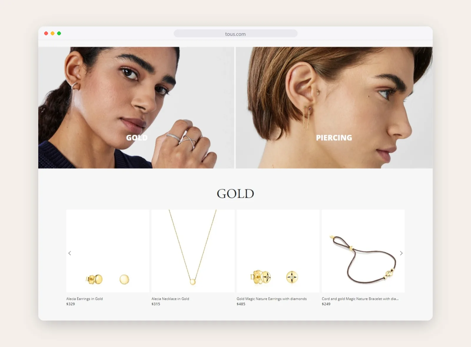
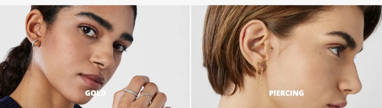
Gold, piercing and other edits group pieces the way people actually shop for jewelry.
Tous
An online store for Tous that treats every piece like the star of the page, from the seasonal campaign to the smallest pendant.
Services
- Ecommerce UX design
- Homepage and merchandising layouts
- Collection and product pages
- Mobile experience
The ask
Tous began in 1920 as a watch repair workshop in Manresa, near Barcelona, and grew into an international jewelry brand with its teddy bear as a signature. It sells in many countries, and the online store has to work for all of them.
Jewelry sells on detail and on mood. The site had to carry both: big seasonal campaigns that set the tone, and product pages clear enough that someone can buy a ring without ever holding it.
Key features
- Campaign-led homepage
- Shop by category
- New arrivals and edits
- Klarna and WhatsApp support
The solution
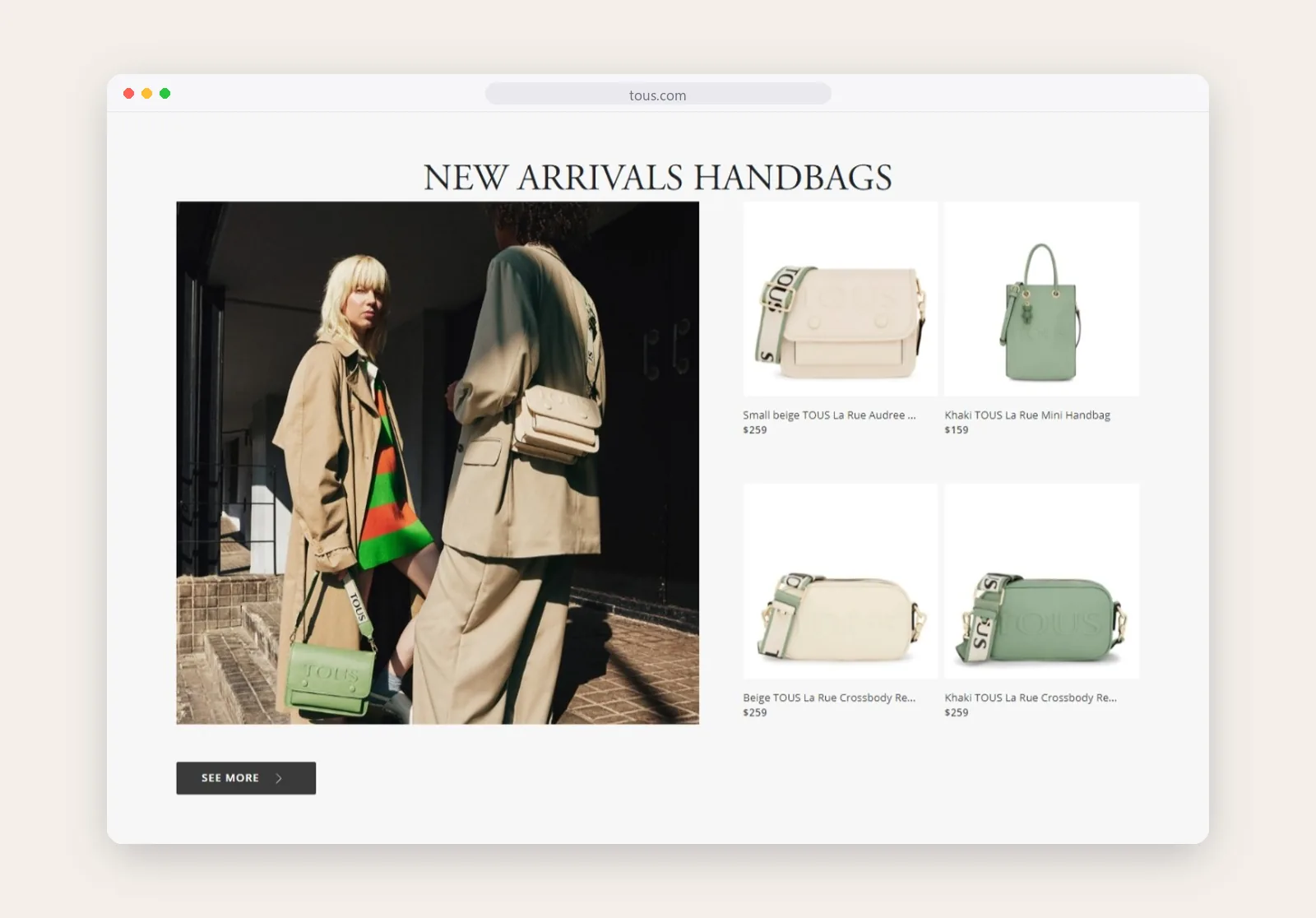
We built the homepage like a magazine spread. A full-width campaign opens the page, then the site moves quickly into what is new and into clear routes by category, so people who came to browse and people who came to buy both find their way.
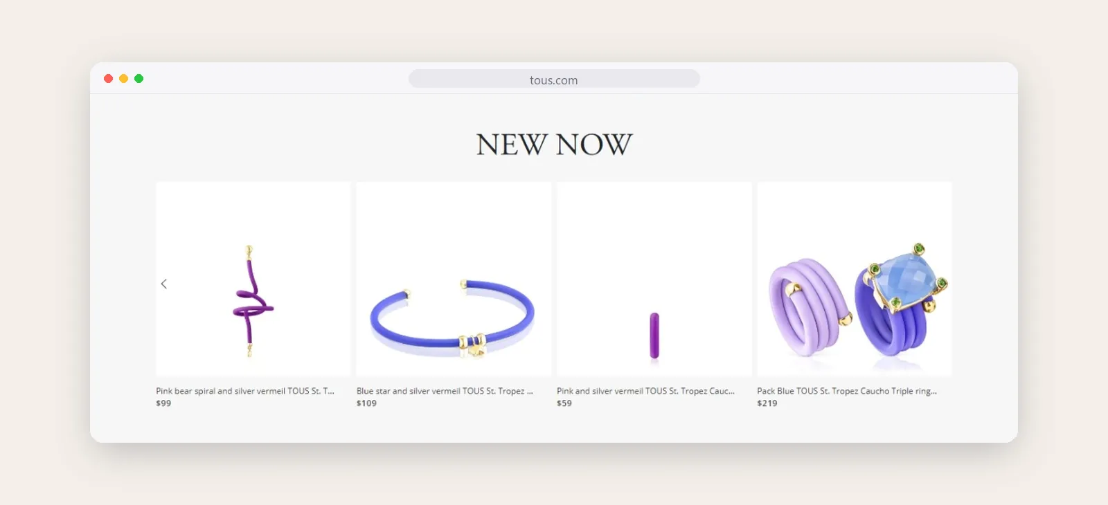
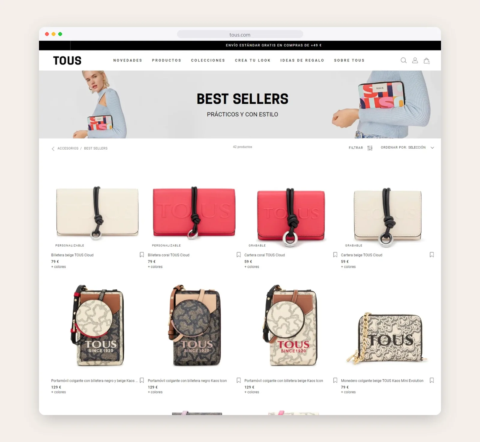
Collection pages keep things simple. A clean four-column grid, clear prices and filters that stay out of the way. The product photography does the selling, so it gets the space.
Service details sit where they help. Pay-later options, WhatsApp support and delivery information appear at the moments people usually hesitate.

Shop by category
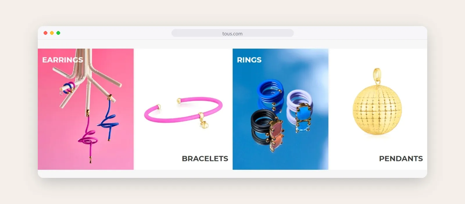
Earrings, bracelets, rings and pendants each get a bold tile, so people can jump straight to what they came for.
Collection pages
A clean grid with clear prices and filters, built to make a large catalogue easy to scan.
Edits by material