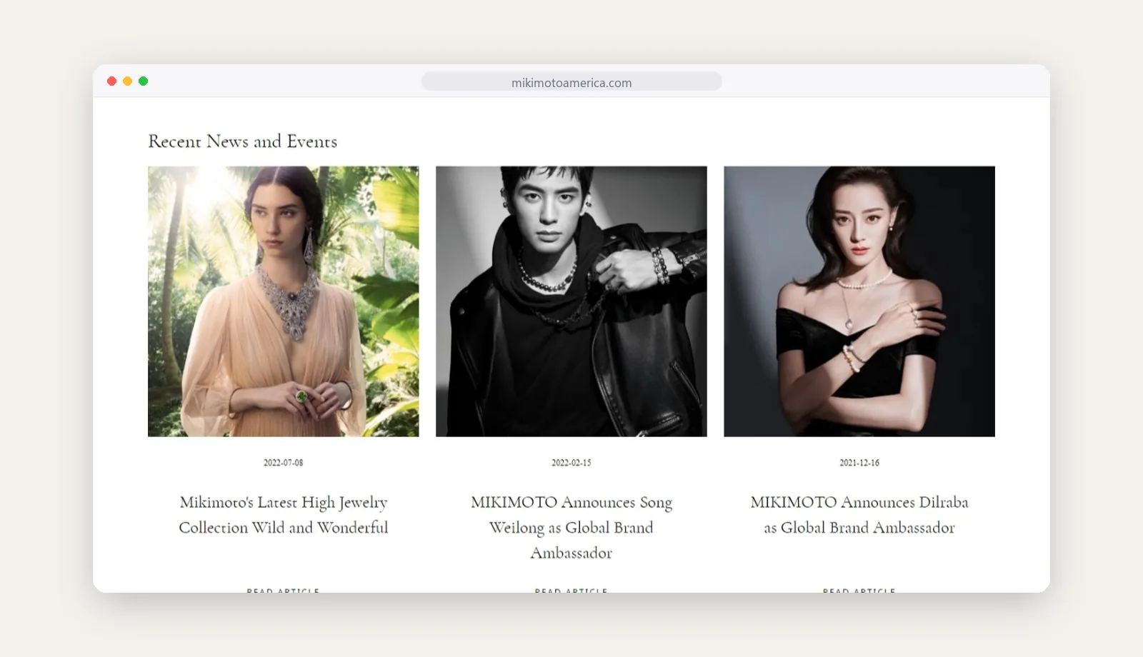
Campaigns, ambassadors and events have a home on the site, which keeps the brand story current.

Mikimoto America
An online store for Mikimoto America that feels like a quiet, well-lit boutique, built around the pearl.
Services
- Ecommerce UX design
- Luxury storefront design
- Collection and product pages
- Mobile experience
The ask
Kokichi Mikimoto created the first cultured pearl in 1893, and the house that carries his name is still defined by pearls. Mikimoto America needed an online store that matches the experience of its boutiques: calm, spacious and exact.
Luxury shoppers look closely. The site had to show pearls with the detail they deserve and give high jewelry campaigns room to breathe, while keeping the path to purchase simple.
Key features
- Editorial campaign pages
- Featured and recently viewed products
- Collection stories
- Affirm monthly payments
The solution
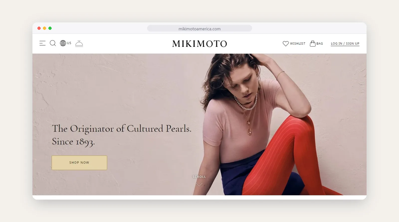
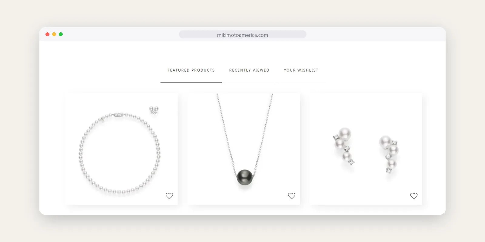
We gave the store a lot of white space and let the photography lead. The homepage opens with one campaign image and one line of brand story, then moves into featured pieces, each shown alone on a clean background.
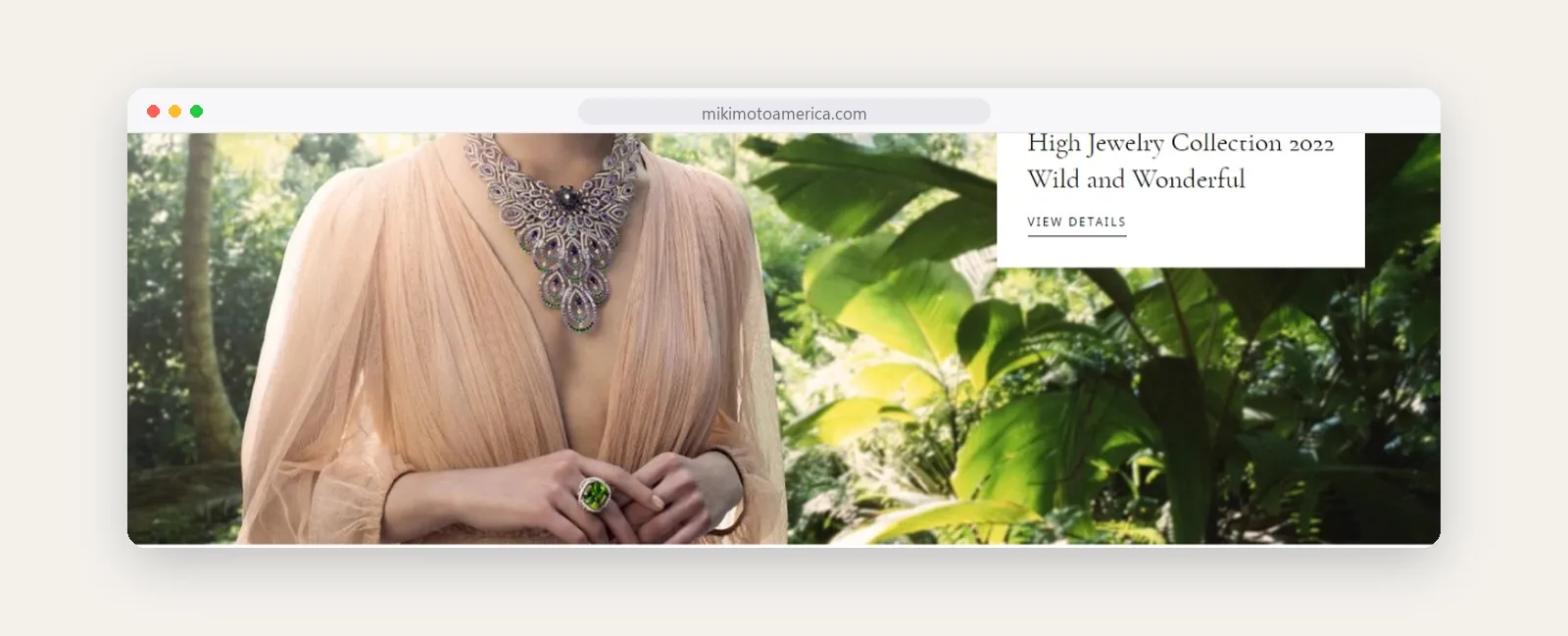
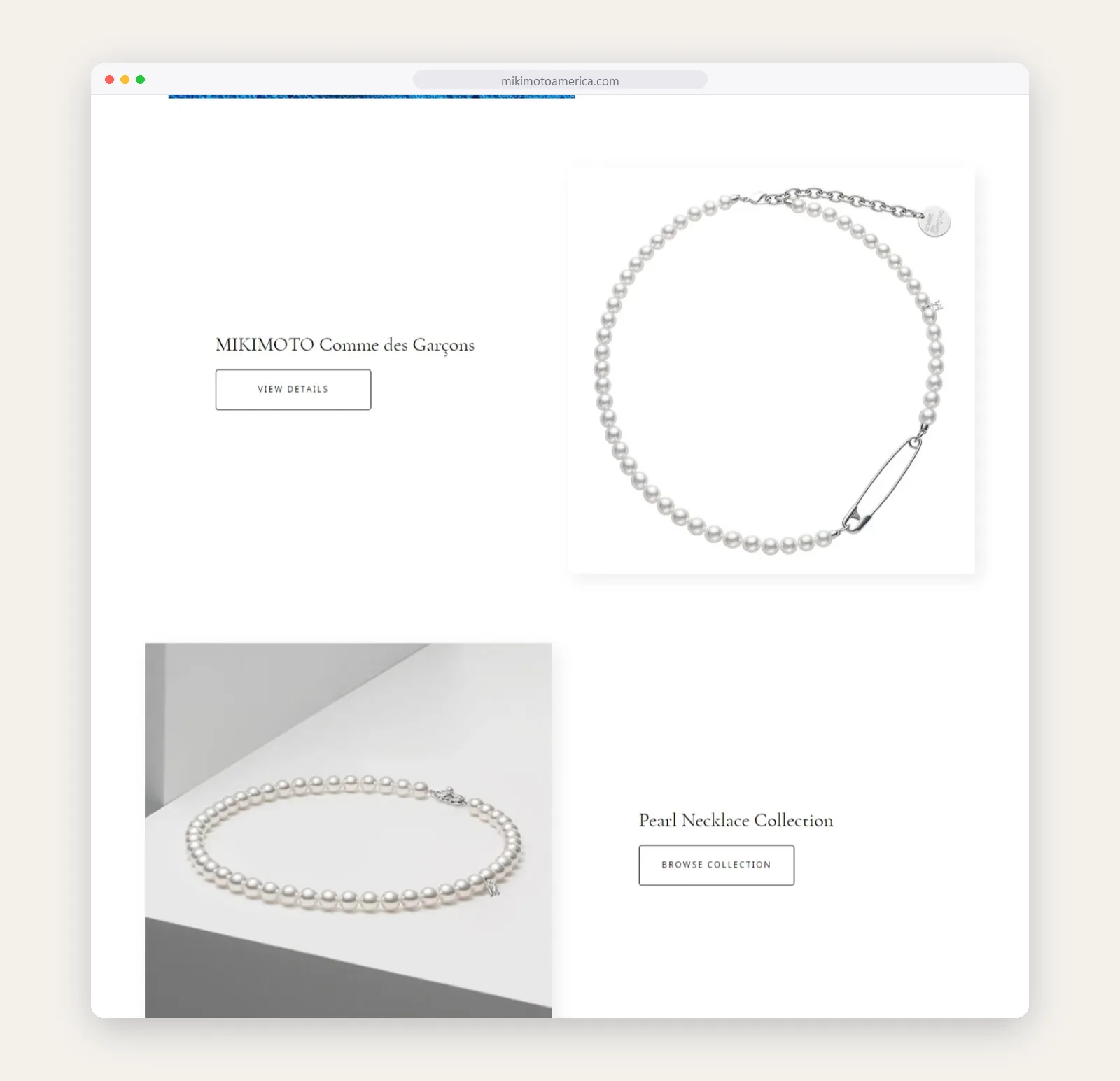
Collections are introduced like chapters, with an image, a short description and one clear link. A shopper can move from a high jewelry campaign to an everyday strand without the page ever feeling crowded.
News and events have their own section, and payment options such as Affirm appear close to the point of purchase.
Collections as stories
Each collection gets its own image and a short introduction, laid out with room to breathe.
Product cards
Pieces sit alone on white, so the lustre and detail of each pearl is the first thing you see.

News and events