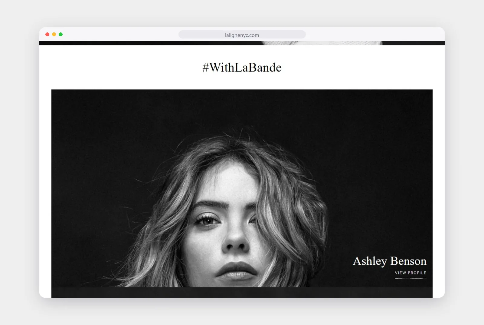
Portraits of the people who wear La Ligne, each linked to a profile, bring the community onto the homepage.
La Ligne
An online store for La Ligne that is as confident as the stripe it is known for.
Services
- Ecommerce UX design
- Homepage and editorial layouts
- Collection pages
- Mobile experience
The ask
La Ligne is a New York women’s fashion label built around the stripe, with easy pieces meant to be worn again and again. Its community, which it calls La Bande, is a big part of the brand, and it includes plenty of well-known faces.
The store needed to sell new drops quickly while giving that community and the brand’s editorial voice real space on the page.
Key features
- Drop-led homepage
- Story tiles and editorial
- #WithLaBande community
- Clean collection grids
The solution
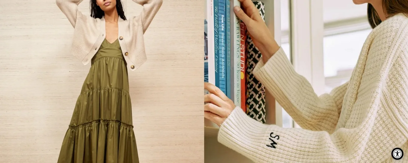
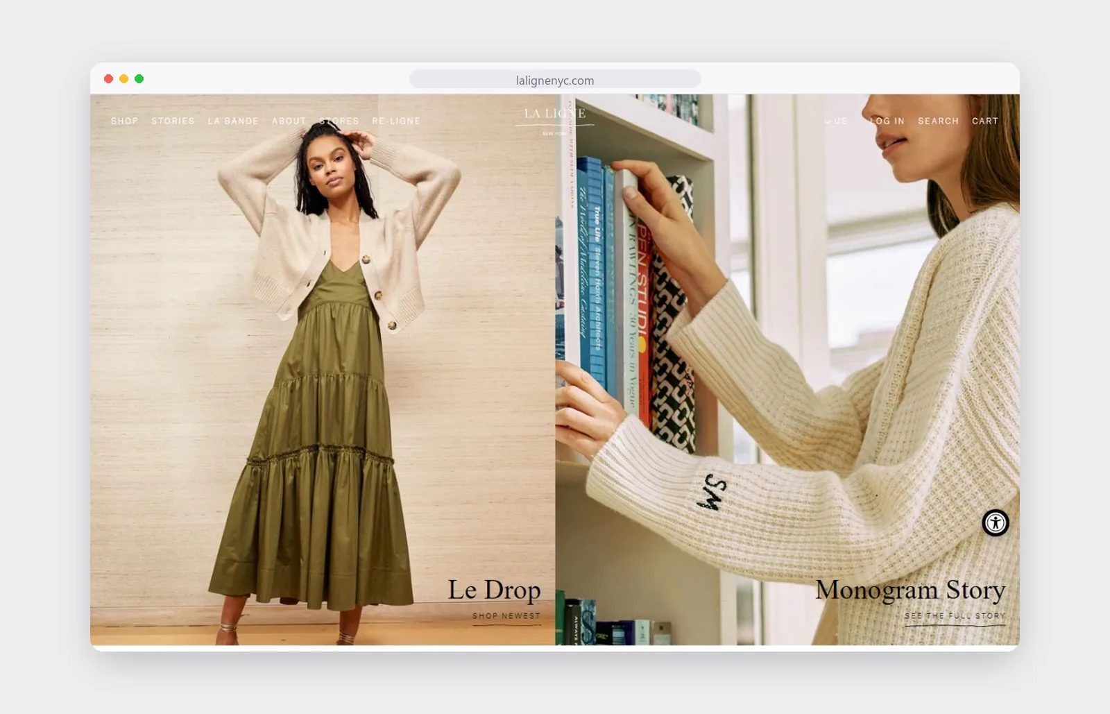
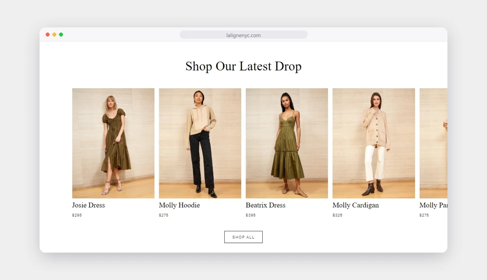
We designed the homepage around the latest drop. A split hero leads with the newest pieces, and a carousel of the drop sits a short scroll below, so returning customers can see what is new in seconds.
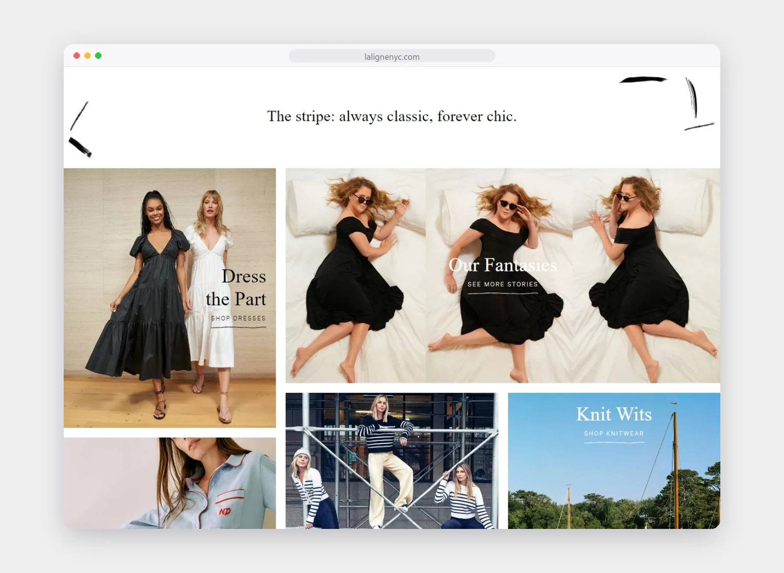
Between the shopping, the page tells stories. Tiles for dresses, knitwear and the brand’s own features break up the grid, and the #WithLaBande section shows the people who wear La Ligne.
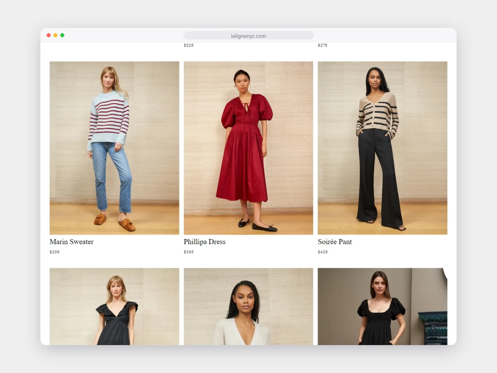
Collection pages stay simple: large photos on a warm neutral background, the name and price underneath, and nothing else competing for attention.
What's new
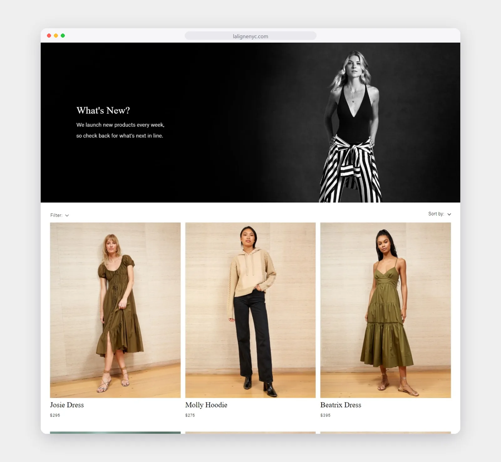
A bold banner introduces each new arrivals edit before the grid begins.
Collection grids
Three large images per row, all shot on the same backdrop, so the clothes are easy to compare.
#WithLaBande